

Issue #32 – Building Effective Dashboards (Part 2 – Optimal Design Principles)
Discounting your user's needs leads to 100% less usage; here's how you make the dashboard experience better

Read time: 10 minutes
What does an effective dashboard even mean?
I think if you asked 50 people that question, you would get similar answers:
It allows users to inspect the data
It shows a simple view of key metrics
It draws out insights that help improve decisions
It spurs individuals into taking action on their findings
But if you asked those same 50 people to build an effective dashboard, you would probably get 50 different looking dashboards.
Why?
Because design is hard! It’s subjective, time-consuming, and cumbersome. It also requires input from various people, delays development time, and is constantly changing.
For these reasons, analysts sometimes skip or rush through the design phase. And I don’t blame them, they have deadlines and stakeholder requirements that reduce their ability to think about what they need to build before actually building it.
So on the back of last week’s article about dashboarding strategically (which you should read if you haven’t), it’s time to dig into how to design an effective dashboard!
The Five A’s of Dashboard Design
Designing the best dashboard will always be a subjective, creative and bespoke process. There is no ideal template or perfect output; quality relies on the situation and the context.
And that is how I learned how to design, catering whatever I build to what is needed. For dashboard design and development, I have created a framework I’ve deemed the 5 A’s:
1. Audience
2. Automation
3. Accessibility
4. Analysis
5. Action

Audience
The first A is the most important one.
Because if you lose the audience, nothing else matters.
I’ve written on this topic multiple times, from understanding your stakeholders to scoping your data product.


Simply put, you need to understand your audience. What do they do everyday? What decisions do they make? What actions do they take based on those decisions? What KPIs do they track or have targets for? How does data underpin all these things? What frustrations do they have with the current setup, process or tools?
And this will differ based on the position or level of the individual, so remember to map out who your users are and what they want!
Automation
As I mentioned last week, a key reason dashboards are helpful is the elimination of menial tasks and the ability to expedite a user’s path to insights.
The role of automation is therefore crucial.
It is not enough to build a dashboard that just neatly displays the same data from Excel; it needs to bring data together and make it easier for the user.
Automating the data joins, filtering, cleaning and visualising reports, and reducing manual Excel formulas or copy and pasting is the whole point of well-designed and architected dashboards.
There is room to go beyond this as well. Common dashboard tools feature notifications that trigger based on specific thresholds. They also easily link to data warehouses or storage platforms, allowing direct pulls via pipelines and automated refreshes at set times (or real-time, only if warranted).
My only warning is that integrations can be difficult, especially when they are manually built (this causes constant breakage). Interactive orchestration platform tools such as Orchestra are great ways to make this job easier. This helps users manage tasks, tracks dependencies and integrates directly with BI tools, basically giving analysts an engineering helping hand to improve automation and reduce dependencies on engineers.
Whether it’s Orchestra, another tool, or you have engineers at your disposal (a rare occurrence…), you need to factor in how automation can lift the usability and functionality of your dashboard design!
Accessibility
There are two components to accessibility:
Access to data
Making the design accessible to all individuals
Both are crucial in their own way. Yet, often, they are overlooked.
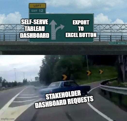
The first of the two—access to data—is about building trust with your stakeholders. Any dashboard user will want to understand how the KPIs are calculated and where the data comes from. They will likely want to press the Export to Excel button to investigate the data themselves. Analysts often get offended by this, believing users spurn their advice and don’t trust their abilities.
In reality, humans just need confirmation and many people need to look behind the curtain themselves to trust that what they are seeing is actually factual.
The second component has become more prevalent of late, especially with more awareness about disabilities or impairments that are hard to know about (like colour blindness, for example). Inclusivity is important! Moreover, the secondary impacts of designing in this way have wide-reaching implications—it promotes the idea of well thought-out design that is simple and visually appealing. Elements of this might include:
Standardised colour schemes that work for colour-blind users
Clear, legible typography
Responsive designs that work on mobile and desktop
Simple, intuitive navigation
Alternative text for images
In design, accessibility is everything, so think about these two elements!
Analysis
The fourth component is where we focus on the insights-led mentality.
Too often, I’ve seen BI and data analysts focus on visuals and pure design, transplanting data into charts that tell users nothing. While data viz is important (as mentioned above), it shouldn’t come at the expense of good analytics.
Returning to the automation point, dashboards should exist to eliminate menial tasks and guide the user to insights and better decisions.
Designing your dashboard with the right analysis in mind is therefore crucial.
From a basic viewpoint, this might include having the right KPIs, charts and interactive elements for users to use when making decisions.
At an intermediate level, this is about thinking through the users' business questions, applying additional analysis on top of basic information (e.g., customer segmentation, financial analysis, propensity models, etc.), and showing comparative views or benchmarks to draw insights.
Finally from an advanced perspective, this might include integrated analytics drawing on more data sources or even embedded AI models that provide text-based insights from questions you may have.
Ultimately, doing the right analysis depends on the audience, your data, and the insights you need. Even if certain analytics seem far-fetched, you can build towards those capabilities in the future.
Action
The final A on my list—Action—is probably the most important (it's a tight race with the audience).
Why? Because without action, nothing gets done.
Dashboards are operational tools designed to drive decision-making. The ultimate measure of a dashboard's success is not its aesthetic appeal or data complexity, but the actions it inspires.
This means designing with an end goal in mind. Every visualisation, KPI, and interactive element should have a clear pathway to potential business action.
Are you showing sales performance? There should be clear indicators of where to focus sales efforts.
Displaying customer churn? The dashboard should highlight exactly which customer segments or behaviours are most at risk.
Consider building direct action triggers into your dashboard design:
Embedded workflow links that take users directly to the next steps or different operational tools
Comparison views that highlight performance gaps
Predictive insights with recommended interventions
Clear thresholds that signal when immediate action is required
The best dashboards don't just inform—they transform information into action. They create a sense of urgency, provide clarity, and make the path forward so obvious that users can't help but act.
Remember, data without action is just decoration.
And in the end, action is the ultimate validation of great dashboard design.
The Essential Design Tips
On the back of the five A’s of dashboarding, I have listed five design tips that you should keep in mind:
Minimalistic & Intuitive Layout – Keep the dashboard basic and to the point. Be selective with your KPIs and avoid too much information. Clear navigation, a user-friendly interface and informative visuals (humans process images much faster than text) make all the difference. Test this out by applying the 5-second rule: does your dashboard answer your stakeholders’ most important questions within five seconds?
Logical Layout – List your information hierarchically, mimicking how a user would view it. This usually means organising the most important information at the top, with increasing detail trending down. One organising principle you can think of is the inverted pyramid, which divides the contents of your dashboard into three (insights up top, trends in the middle and details at the bottom). Another popular one is the Z-perspective, which puts information the way your eyes typically travel over the page (starting at the top left in a Z pattern down to the bottom right).

Two common approaches to dashboard design: 1) Inverted Pyramid and 2) Z-Shape Pattern Design Consistency – To deliver against the accessibility requirements, ensure consistent use of fonts, colours, and layout. Stick to your company’s colour palette and fonts. Don’t go rogue with chart design or selection; choose what people understand and can interpret. Consistency also extends to data sourcing and manipulation, which is crucial for creating stakeholder trust.
Interactivity – Better tools have increased the options for interactivity: (1) The ability to manipulate, sort, and access the detailed data tables; (2) hovering or pop-up information above graphs/ maps to provide insights or additional detail; (3) including hyperlinks to documentation, additional analyses or data sources; and finally (4) having an Export to Excel button, because every user requests it.

All roads lead to Export to Excel Customised Filters – Having filters is common, but be careful about which ones you need. A great hack is adding customised filters to personalise the dashboard for the users’ needs (e.g., a user may only work with 10 of the 15,000 accounts). Link these filters to notifications or views, and your users will be able to find the data quickly and use the dashboard more effectively.

The Art of Wireframing
These design tips and pointers are great but hard to implement all at once.
Yet, that is usually how analysts try to approach it. They fire up Tableau or Power BI and start moving stuff onto a page to get something working. After a certain point, it becomes too hard to redesign the dashboard, and your visual version of tech debt sets in.
Most dashboards die not because of bad data, but
because of terrible design
This is why wireframing before you build is so essential!
A dashboard wireframe is an outline or blueprint of the dashboard interface. It lays out the visual arrangement of different technical elements, linking the business requirements and requests with the look and feel of the tool.
Essentially, just as a dashboard simplifies data, a wireframe simplifies the dashboard design, making it understandable for non-technical users and allowing them to provide feedback as necessary.
When building a wireframe, what do you need to keep in mind? Some people think it is just a rough draft of their dashboard.
But it should be so much more than that. So here are the things to keep in mind:
Align it to User Stories, Business Questions, or Requests
What is your user’s journey to do their day job? How does your wireframe reflect their specific needs, unique narratives or objectives? The wireframe should communicate why each component matters and how it will drive decision-making, anchored in the real-world business context.
Facilitate Feedback with Wireframe
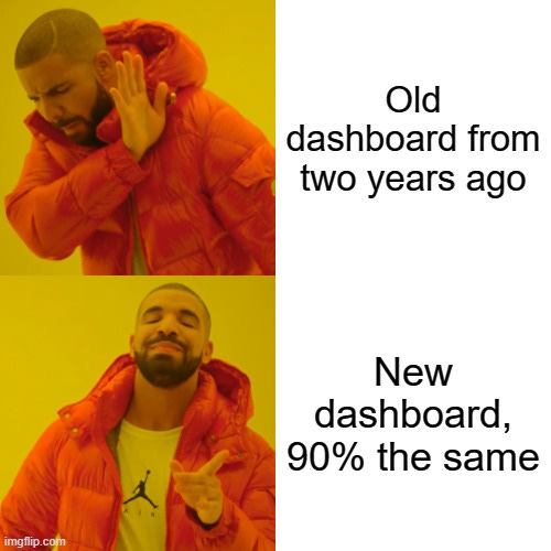
Wireframes are a low-fidelity communication tool that allows stakeholders to visualise and critique dashboard concepts before significant development resources are committed. Therefore, feedback is your best friend! The wireframe should facilitate this by enabling collaborative refinement, especially with an iterative process incorporating stakeholder perspectives and training. And it prevents recreating the same thing two years later…
Explain Different Components
Dashboards get complicated fast. Widgets like filters are fairly straightforward, but what about nested filters, notifications, deep-dive selections, etc? To ensure the dashboard is useable, explain the purpose and how to use each component in the wireframe. This includes the ‘how to’ for different charts, their use, and the business questions they answer.
Define Data Sources/ Transformations
Users don’t use dashboards because they don’t trust/ understand the data. Mapping out the data lineage, architecture, sources, and transformations can help reduce that mistrust. The wireframe is the best way to do this, especially because it is usually built on tools like Figma or PowerPoint that easily allow for additional documentation that is built in a business-friendly way. These are also best practices for building a scalable data model and promoting data democratisation within business teams.
User Experience & Prioritised Information
Dashboard design is fundamentally about creating a hierarchy of information that guides users' attention to the most critical insights without creating cognitive overload. Use your wireframe to sketch out the user’s journey, improving the overall experience and prioritising the right information. Then seek feedback as mentioned above!

In the end, designing dashboards isn't a technical exercise—it's a human-centred design challenge. Your goal isn't to showcase how much data you can display but how effectively you can help someone gather insights and make a decision.
I’ve seen too many dashboards that are just pretty versions of an existing Excel doc. Take your skills beyond that and think about the holistic purpose and need for the dashboard. Make sure to take your time and wireframe what’s best. Then, and only then, will you ensure your dashboards are used daily instead of forgotten by the business.
Next week we will be doing a recap of the top The Data Ecosystem articles from this year. Consider it a best of the best with a TLDR executive summary for each topic area. See you then!
Thanks for the read! Comment below and share the newsletter/ issue if you think it is relevant! Feel free to also follow me on LinkedIn (very active) or Medium (increasingly active). Finally, if you would like to work with me and my consultancy Profusion, please do reach out via LinkedIn. See you amazing folks next week!