


Issue #31 – Building Effective Dashboards (Part 1 – Dashboarding Strategically)
Dashboards aren’t dead; we just need to build them more strategically

Read time: 11 minutes
Dashboards are a fickle beast.
Teams constantly clamour for more, yet half fall into disarray and collect dust.
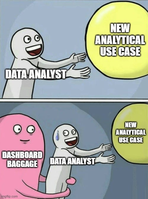
Creating a love-hate relationship with the tool, often resulting in Executives pulling the plug on crucial analytical projects because of failed dashboard experiences in the past (let’s call this dashboard baggage for the purpose of this article).
This feeling climaxed when dashboards were called dead (by ThoughtSpot and other writers) a few years back.
Whether it be the growth of GenAI, dashboard maintenance costs, a move back to manual reports, poor data literacy, incorrect metrics, or poor functionality, dashboards weren’t delivering the analytical value companies had hoped they would.
ThoughtSpot even went so far as to claim these BI tools were meant to be used by data analysts, not regular business users.
Yet, despite that, companies all over are still investing in dashboards. Why? Because they are the easiest way to display metrics that need to be surfaced to business stakeholders. They are visually appealing. They provide access to data. They combine KPIs. Overall, they can give the analytical value that company leaders crave.
But these fear-mongering titled articles are right, dashboards should be done better. So, let’s uncover how we can improve on these part-legacy, part-coveted analytical tools!
Why Do Dashboards Fail?
Before building effective dashboards, let's address the elephant in the room – Why do they fail? Why do they collect dust?
What I usually hear from stakeholders is that there are just too many dashboards or the data doesn’t match up, or it’s not fit for purpose.
However, it’s hard to dig into these pain points; they are too high-level to act on.
So, I’ve broken them down into lower-level root causes (you know how much I love root causes):
Ad Hoc Requests – Business users expect analytics teams to instantly pull valuable data or insights. Ten minutes later they forget about their request. Unfortunately, ad hoc requests often lead to a backlog of dashboard features, increased complexity, and too many existing dashboards. Oh and the business is never satisfied with their data requests, so you can’t win!
Analysis Paralysis – Too many metrics or KPIs make dashboards hard to follow and impossible to use. Data people forget that more choice leads to more indecision. If you aren’t pointed with your metrics, the quality of your analysis (and eventual insights) will suffer.
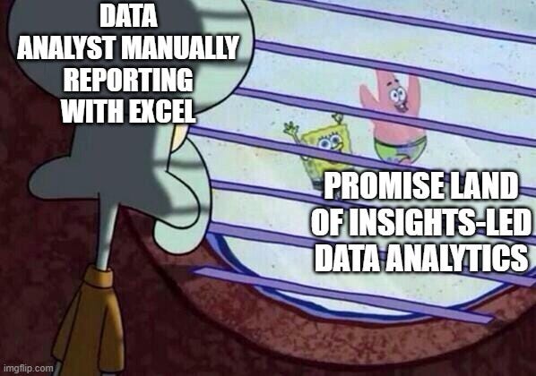
Complexity Ruins Progress – This builds on the previous two. But goes beyond it. When business users run into dashboards that are too complex, they run. And they don’t come back. Instead, they retreat to their safe tool (aka manual Excel spreadsheets), making it harder to adopt new analytical tools. Hence, complexity doesn’t just have short-term implications, it can actually stall progress for years to come.
No Insight, No Implications – Data analysts are inherently lazy. It’s not that they don’t put in the work, but more so that they don’t go beyond the obvious or the easy. Dashboards should aspire to be diagnostic. Descriptive dashboards are great for surfacing issues, but if you can layer on the ‘why’ or the ‘so what’ that is what really counts.
Waiting Destroys Patience – Humans are impatient creatures. And we don’t think rationally. Therefore, a dashboard that takes 30 seconds to load or buffer seems more cumbersome than an Excel sheet that takes 2 minutes to calculate and run manually. Anticipating query performance is often overlooked in dashboard creation, and it can ruin the experience for a lot of business users.
Inherent Lack of Trust – Drew Mooney posted about this topic the day before I published this article (forcing a last-minute edit). He says, “The unspoken reason a stakeholder prefers to look at data in spreadsheets instead of a well-crafted dashboard = Lack of trust.” People like to dig into the details, understand the data and know the facts behind the insights they draw out. And the process teams take to build dashboards doesn’t often give that confidence…
In the end, dashboard failure can come from many sources (more than what was listed above), but some are very obvious—poor data quality—and others sometimes slip under the radar. It’s essential to think of them all because they all have the same negative outcome.
The Real Purpose of Dashboards
I don’t want to just repeat the obvious reasons ChatGPT will give you (e.g., source of common metrics, easy functionality, automated reporting, etc.). No, if you know me, I want to get beyond the obvious.
1) Enable Insights-Led Thinking
Even the smartest person can’t make the best decisions if they don’t have the relevant data. Historically, insights came from an individual piecing together data manually. The problem? That takes time.
Dashboards exist to reduce the time to insight. By making data visibility the default state rather than an afterthought, teams can frame discussions around data evidence rather than gut feel and spend more time thinking about the ‘so what’. Moreover, customised analysis (e.g., customer segmentation, forecasting, etc.) can be integrated with dashboard views, ingraining additional analytical insights within the tool.
An insights-led cultural shift is not instant but with the right tooling and training, this mindset does lead to better decisions founded upon a well-used suite of dashboards.
2) Uplifting Employee Capability Through Self-Service
People learn better from doing tasks than paid L&D courses/ certifications. So, while companies have high expectations of one-day Data Literacy trainings or ChatGPT subscriptions to improve employee skills, there may be more needed.
Individuals need to use data to get better at it. This is why I’m still bullish on dashboards. They won’t immediately make your employees data experts, but self-service will uplift their data reasoning and analytical thinking. Users learn to interpret trends, understand statistical concepts, and think critically about metrics through regular exposure and interaction.
This organic learning is often more effective than formal training because it happens in the context of real business problems that matter to the user. And with data readily available, the manual tasks they used to do are hopefully reduced.
3) Automating Menial Tasks
Every time I work with a client, I’m amazed at how many people spend half their working hours repeatedly pulling the same numbers and copying and pasting the same data into a format week after week. And it’s not their fault, that is how analytics has been done for years or even decades.
Properly built dashboards have the power to change this. And I’m not talking about Excel dashboards because this often requires significant manual adjustments and time to calculate (although improved Power Query and Python integration have improved this).
Data engineering pipelines can align different data pulls across sources, embedding analytical calculations to prepare the data for the dashboard. The dashboard then automates the tedious work, allowing analysts and businesses to focus on higher-value activities like deep-dive analysis and strategic recommendations. Not only does this save time, but it helps retain top talent by keeping them engaged with challenging work rather than routine reporting.
4) Standardising Metrics & Processes
Mark de Jong went into great detail about this in The Data Ecosystem last week, so I won’t belabour the points. Nonetheless, standardising KPIs and processes is worth mentioning.

Dashboards provide a common source for accessing metrics, making it an ideal place to standardise them. During the design of dashboards, teams should agree on a common KPI dictionary and what will be represented in the tool, aligned across departments and hierarchy levels.
The standardisation extends to processes. Dashboards that are widely used across teams can subtly enforce business processes. Think about processes involved in weekly sales meetings or Executive quarterly reports. By revolving these events around dashboard tools, metrics and outputs become highly visible, and teams must be better (and more transparent) about ensuring the data that goes into it (like sales call outcomes) is of high quality. The dashboard, therefore, becomes a passive enforcement mechanism for best practices.
5) Single Source of Analytical Truth
Single sources of truth are often pipedreams. But sometimes, if you get lucky, you may get an organisation with consistent data within their warehouse or lake.
But consistent data doesn’t mean consistent analytics.
As data flows to different teams, the same metrics are often calculated slightly differently, leading to "multiple versions of the truth" regarding business outcomes, eroding trust in the data. Well-designed dashboards solve this by codifying metric definitions, calculation methodologies, and data hierarchies in one authoritative place. This standardisation becomes particularly crucial during cross-functional meetings where different departments must align on performance measures to determine success.
Approaching Dashboards in a Strategic Way
People think analytical tools and data products (like dashboards) are inherently strategic.
They aren’t.
Why? Because companies enlist analysts to build these solutions to solve ad hoc problems and don’t think about their long-term strategic benefits (or what they could evolve into).
Does every company need a full-fledged Data Strategy to solve this? No.
Should every company think more strategically about how they build dashboards? Yes!
Let’s refer back to the six reasons dashboards fail and the five reasons for existence.

And with those points in mind, lets look at how to approach dashboards strategically.

Data analysts like to immediately jump into the details, whether that be the data, the visualisations, or the functionality. I recommend taking a step back and looking at the long-term analytical strategy/ approach:
Think about what dashboards, reports and analytical tools already exist
Write down what they are, who their users are and the business questions they answer (there will probably be some duplication)
Figure out what is used vs. what isn’t used and why
Schedule check-ins with business stakeholders at regular quarterly intervals to get an ongoing view of these things
This lack of a long-term analytical view is the biggest reason for failure. It makes data go from a strategic priority to an ad hoc responsibility, causing many of the failures we mentioned.
Feeding into this long-term strategic view should be requirements gathering across business teams. There are two parts to this. The first is thinking about what analytical and business teams are requesting, now and in the future. As the data analyst, it is also worth lending your experience to suggest what other realistic analytical methods they could use. From this angle, don’t think about requirements gathering from an individual dashboard view; think from a portfolio view. For example, we have a CRM and a sales dashboard, but could we potentially also use some customer analytics to augment those tools to create a single customer view?
The second part of the requirements gathering is workshopping the data sources and workflows. A great way to approach this is by mapping out all the data sources the team has and creating lineage diagrams to show how the data connects from source to consumption. If you can articulate the transformations/ processing, all the better. This exercise helps standardise the metrics, data and processes to get the results and is a simplified approach to Solutions Architecture (which is not done by enough data teams).
Next are two steps to build the individual dashboards you’ve prioritised. Next week, I will talk more about wireframing and design, but the key thing to remember here is to think about the end-state as a suite of dashboards. Design them holistically to cover off your required KPIs & metrics, and keep them simple, not complex!
From a dashboard or data product build perspective, I recently wrote an article on this, including a super helpful operational delivery model (see image below). The main thing I want to point out is that any dashboard build has to be done closely with stakeholders. They need to see themselves using the product and trust the data that goes into it. Understandable documentation and diagrams are crucial, as is having the right champions to promote the product within the business.


Speaking of adoption, you must consider training and feedback loops as part of your strategic approach. Nip ad hoc requests in the bud by evolving users’ data literacy. Training shouldn’t happen all at once; do it in phases, testing your training with a select 2-3 individuals, augmenting your materials and getting feedback on your build. Then, roll it out to more stakeholders, tapping into the previous trainees as champions. Articulate the holistic analytical strategy to everybody, proving that you have thought of everything so they don’t keep adding features to your current build.
The last element that can take your dashboard game to the next level is augmenting it through GenAI. Imagine ChatGPT-like features embedded in your dashboard, pulling out insights and wrangling together implications in easy-to-interpret ways. In full transparency, I haven’t yet built this into any of my dashboard products, but I don’t foresee it being too tricky, especially given how many LLM plug-ins exist. As long as you understand the parameters to set, the data to draw upon, and train the users on the inherent limitations (it won’t be as advanced as Claude.ai or ChatGPT), it could be a game changer for your business! In addition to AI, other analytical tools can be integrated, like customer segmentation models, automated sales forecasting, or whatever you want, depending on the use case.
To Conclude…
Dashboards aren’t dead, but without proper care, their usefulness is dying. Despite analysts focusing on technical skills, most of it comes down to strategic thinking and user handholding.
Next week, we'll dive into the design portion of effective dashboards, including how to wireframe a nice-looking product/ tool. And if you are interested in doing a strategic build of your analytical assets in real life, feel free to reach out, as my firm Profusion has done quite a few of these analytical strategies for clients. See you then!
Thanks for the read! Comment below and share the newsletter/ issue if you think it is relevant! Feel free to also follow me on LinkedIn (very active) or Medium (increasingly active). See you amazing folks next week!
Thanks Dylan! Good read!
I have noticed that I prefer data dashboards that also have a proper modern UI/UX and not something from the 2010s 🙈